It has become a trend for brands to change or modify their logos from time to time, especially with the intention of keeping up with current trends. Recently, Mazda has joined the bandwagon by announcing a new version of its brand symbol.
Mazda says its new brand symbol inherits the spirit of the emblem introduced in June 1997, representing the letter ‘M’ with the evocation of soaring wings. Alongside the new symbol, the company has also changed the wordmark (font) of its name.
Compared to the previous logo, the new design retains the signature oval outline and stylised ‘V’ shape that symbolises wings in flight but simplifies the overall appearance by removing the metallic texture and 3D effects of the old design. Additionally, the older version featured a chrome finish and depth that gave it a more mechanical, automotive feel, while the new flat design embraces modern minimalism and digital versatility.
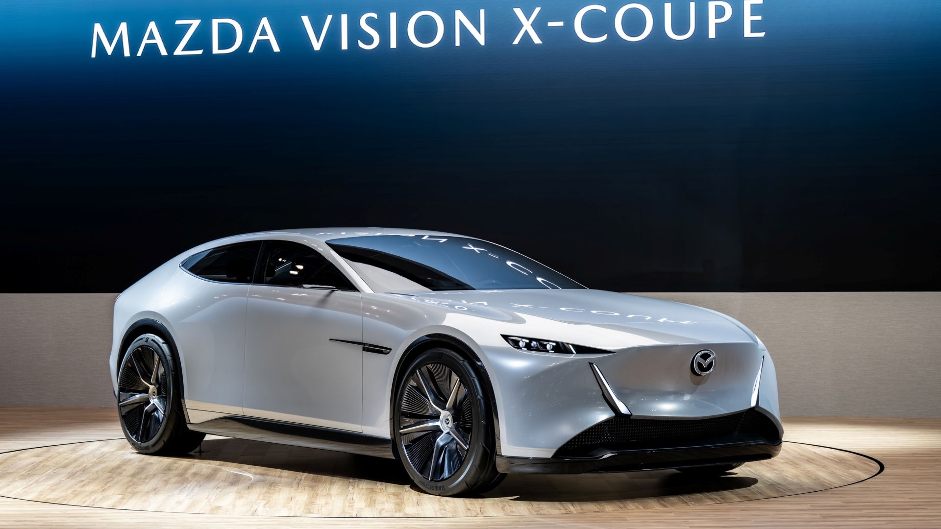
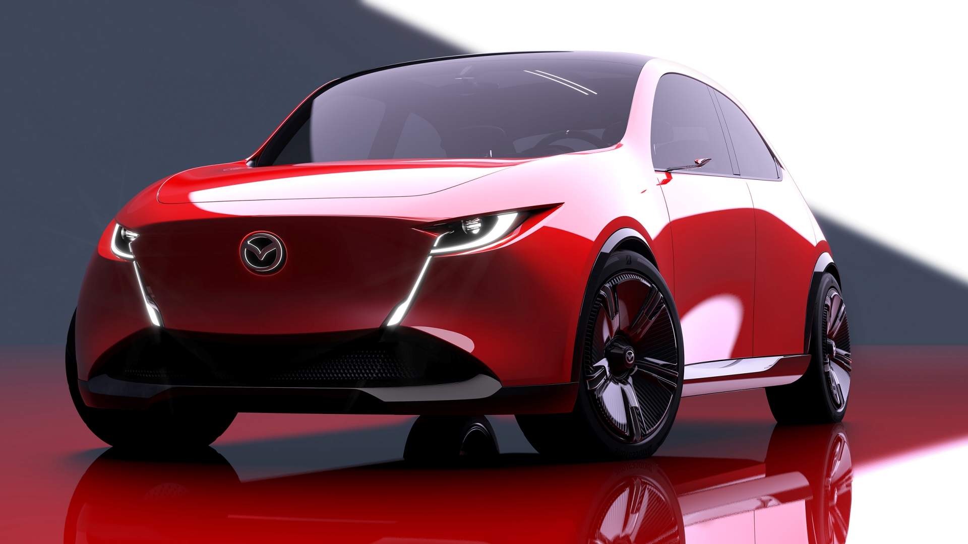
Mazda says the new logo will be gradually rolled out and can already be seen at the automaker’s website, as well as its booth at the ongoing Japan Mobility Show 2025 event. Upon closer inspection, this new emblem was also subtly included on the automaker’s recently unveiled Vision X-Coupe and Vision X-Compact concepts.
(Source: Mazda Press Release)